background-clip
1
| background-clip: text|border-box|padding-box|content-box;
|
background-clip: text 其核心就在于以区块内的文字作为裁剪区域向外裁剪,文字的背景即为区块的背景,文字之外的区域都将被裁剪掉。
简单而言,就是运用了 background-clip: text 的元素,其背景内容只保留文字所在区域部分。
但是目前 background-clip 只在 chrome 上得到很好的支持。
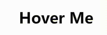
悬浮效果1
1
2
3
4
5
6
7
8
9
10
11
12
13
14
15
16
17
18
19
20
21
22
| <h3 class="hover-1">Hover Me</h3>
<style>
h3 {
font-family: system-ui, sans-serif;
font-size: 3rem;
margin-bottom: 20px;
cursor: pointer;
padding: 0 .1em;
display: table;
}
.hover-1 {
line-height: 1.2em;
color: #0000;
background: linear-gradient(90deg, #1095c1 50%, #000 50%) 100% 0/200% 100% no-repeat;
-webkit-background-clip: text;
transition: .4s;
}
.hover-1:hover {
background-position: 0 0;
}
</style>
|
此效果是通过文字区域背景颜色的变化实现的,所以要将 color 设为透明,以显示出背景颜色。此外,要想背景颜色呈现出滑动效果,不能直接变换 background-image,而是一开始先将背景分成两部分,然后通过移动背景图来实现。
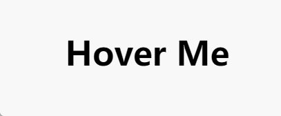
悬浮效果2
1
2
3
4
5
6
7
8
9
10
11
12
13
14
15
16
17
18
19
20
21
22
23
24
25
26
| <h3 class="hover-2">Hover Me</h3>
<style>
h3 {
font-family: system-ui, sans-serif;
font-size: 3rem;
margin-bottom: 20px;
cursor: pointer;
padding: 0 .1em;
display: table;
}
.hover-2 {
line-height: 1.2em;
color: #0000;
background: linear-gradient(90deg, #1095c1 50%, #000 50%) 100% 0/200% 100% no-repeat,
linear-gradient(#1095c1, #1095c1) 0 100%/0 0.1em no-repeat;
padding-bottom: 0.1em;
-webkit-background-clip: text, padding-box;
transition: .5s;
}
.hover-2:hover {
background: linear-gradient(90deg, #1095c1 50%, #000 50%) 0 0/200% 100% no-repeat,
linear-gradient(#1095c1, #1095c1) 0 100%/0100% 0.1em no-repeat;
-webkit-background-clip: text, padding-box;
}
</style>
|
与效果1 相比多了“下划线”的效果。可以通过 border-bottom 留出空间,然后在此添加一个 background,但是由于此时 background-clip 为 text,文本之外的背景不会显示出来,因此在 background-clip 添加 padding-box。
注意:background: val1, val2 与 background-clip: val1, val2 是一一对应的。也就是说,background-clip 的 val1 只作用于background 的 val1,两者互不干扰。
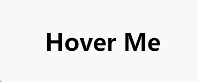
悬浮效果3
1
2
3
4
5
6
7
8
9
10
11
12
13
14
15
16
17
18
19
20
21
22
23
24
25
26
27
| <h3 class="hover-3">Hover Me</h3>
<style>
h3 {
font-family: system-ui, sans-serif;
font-size: 3rem;
margin-bottom: 20px;
cursor: pointer;
padding: 0 .1em;
display: table;
}
.hover-3 {
color: #0000;
line-height: 1.2em;
padding: 0.1em 0;
background: linear-gradient(0deg, #000 50%, #1095c1 50%) 0 100%/100% 200% no-repeat,
linear-gradient(#1095c1, #1095c1) 0 0/0 0.1em no-repeat;
-webkit-background-clip: text, padding-box;
transition: .3s .3s, background-position .3s;
}
.hover-3:hover {
background: linear-gradient(0deg, #000 50%, #1095c1 50%) 0 0/100% 200% no-repeat,
linear-gradient(#1095c1, #1095c1) 0 100%/100% 0.1em no-repeat;
-webkit-background-clip: text, padding-box;
transition: .3s, background-position .3s .3s;
}
</style>
|
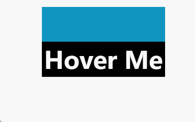
悬浮效果4
1
2
3
4
5
6
7
8
9
10
11
12
13
14
15
16
17
18
19
20
21
22
23
24
25
26
27
28
29
30
31
32
33
34
35
36
| <h3 class="hover-4">Hover Me</h3>
<style>
h3 {
font-family: system-ui, sans-serif;
font-size: 3rem;
margin-bottom: 20px;
cursor: pointer;
padding: 0 .1em;
display: table;
}
.hover-4 {
line-height: 1.4em;
color: #ffffff;
position: relative;
background: linear-gradient(red, red) 0 0/0 0.1em no-repeat;
transition: .4s .4s, background-position .4s;
}
.hover-4:before {
content: "";
position: absolute;
z-index: -1;
inset: -100% 0 0 0;
background: linear-gradient(#1095c1 50%, #000 50%);
transition: .4s;
}
.hover-4:hover {
background: linear-gradient(red, red) 0 100%/100% 0.1em no-repeat;
transition: .4s, background-position .4s .4s;
}
.hover-4:hover:before {
transform: translateY(50%);
transition: .4s .4s;
}
</style>
|
由图可知,两个颜色的背景是一个整体。如果直接设置容器的背景为 background: linear-gradient(#1095c1 50, #000 50%) 0 100%/100% 200% ,那么超出容器的部分背景不会显示,除非将容器的 height 设为原来的两倍。在不想改变 DOM 的情况下,可以通过伪元素 :before 来设置背景图。
悬浮效果5

1
2
3
4
5
6
7
8
9
10
11
12
13
14
15
16
17
18
19
20
21
22
23
24
25
26
27
28
29
30
31
| <h3 class="hover-5">Hover Me</h3>
<style>
h3 {
font-family: system-ui, sans-serif;
font-size: 3rem;
margin-bottom: 20px;
cursor: pointer;
padding: 0 .1em;
display: table;
}
.hover-5 {
line-height: 1.2em;
color: #0000;
background:
linear-gradient(90deg, #ffffff 50%, #1095c1 50%) 100%/200% no-repeat,
linear-gradient(#1095c1, #1095c1) 0/0 no-repeat,
#0000;
-webkit-background-clip: text, padding-box, padding-box;
transition: 0s, color .4s, background-color .4s;
}
.hover-5:hover {
color: #ffffff;
background:
linear-gradient(90deg, #ffffff 50%, #1095c1 50%) 0/200% no-repeat,
linear-gradient(#1095c1, #1095c1) 0/100% no-repeat,
#1095c1;
-webkit-background-clip: text, padding-box, padding-box;
transition: .4s, background-color 0s .4s, color 0s .4s;
}
</style>
|
这里动画结束的效果做了不同的处理。我们用了三层 background(两层渐变,一层 background-color):第一层渐变实现了文字颜色滑动变化的效果;第二层渐变实现了背景颜色滑动变化的效果;第三层 background-color 的作用是在鼠标离开时顶替第二层 background,那么结束时显示就是第三层 backgorund 的效果。
此外,color: #ffffff 延迟 0.4s 是为了顶替第一层 background 的效果,那么结束时文字颜色的效果就是正常的 color 变化效果。
悬浮效果6
1
2
3
4
5
6
7
8
9
10
11
12
13
14
15
16
17
18
19
20
21
22
23
24
25
26
27
| <h3 class="hover-6">Hover Me</h3>
<style>
h3 {
font-family: system-ui, sans-serif;
font-size: 3rem;
margin-bottom: 20px;
cursor: pointer;
padding: 0 .1em;
display: table;
}
.hover-6 {
line-height: 1.2em;
color: #0000;
background:
linear-gradient(0deg, #ffffff 50%, #000 50%) 0 0/100% 200% no-repeat,
linear-gradient(#000, #000) 0 100%/100% 0 no-repeat;
-webkit-background-clip: text, padding-box;
transition: .4s;
}
.hover-6:hover {
background:
linear-gradient(0deg, #ffffff 50%, #000 50%) 0 50%/100% 200% no-repeat,
linear-gradient(#000, #000) 0 100%/100% 50% no-repeat;
-webkit-background-clip: text, padding-box;
}
</style>
|
结合了 text 范围背景与 padding-box 范围背景,使其同步变化即可呈现以上效果。
悬浮效果7
1
2
3
4
5
6
7
8
9
10
11
12
13
14
15
16
17
18
19
20
21
22
23
24
25
26
27
28
| <h3 class="hover-7">Hover Me</h3>
<style>
h3 {
font-family: system-ui, sans-serif;
font-size: 3rem;
margin-bottom: 20px;
cursor: pointer;
padding: 0 .1em;
display: table;
}
.hover-7 {
line-height: 1.2em;
color: #0000;
background:
linear-gradient(-45deg, #000 40%, #ffffff 40%, #ffffff 60%, #000 60%) right/300% no-repeat,
linear-gradient(-45deg, #0000 40%, #000 40%, #000 60%, #0000 60%) right/300% no-repeat;
-webkit-background-clip: text, padding-box;
transition: 0s;
}
.hover-7:hover {
background:
linear-gradient(-45deg, #000 40%, #ffffff 40%, #ffffff 60%, #000 60%) left/300% no-repeat,
linear-gradient(-45deg, #0000 40%, #000 40%, #000 60%, #0000 60%) left/300% no-repeat;
-webkit-background-clip: text, padding-box;
transition: 0.8s;
}
</style>
|
悬浮效果8
1
2
3
4
5
6
7
8
9
10
11
12
13
14
15
16
17
18
19
20
21
22
23
24
25
| <h3 class="hover-8">Hover Me</h3>
<style>
h3 {
font-family: system-ui, sans-serif;
font-size: 3rem;
margin-bottom: 20px;
cursor: pointer;
padding: 0 .1em;
display: table;
}
.hover-8 {
color: #0000;
line-height: 1.2em;
padding: 8px;
background: radial-gradient(circle closest-side, #ffffff 97%, #000), radial-gradient(circle closest-side, #000 97%, #ffffff);
-webkit-background-clip: text, padding-box;
background-position: right;
background-size: 250% 100%;
transition: 1s linear;
}
.hover-8:hover {
background-position: left;
}
</style>
|
radial-gradient
1
| background-image: radial-gradient(shape size at position, start-color, ..., last-color);
|