本文将专注于使用 CSS text-shadow 属性来实现有趣的鼠标悬停效果,但是实际上并不会为这些文本制作任何文本阴影效果。
text-shadow 语法
1
| text-shadow: h-shadow v-shadow blur color;
|
| 参数 |
描述 |
| h-shadow |
必需。水平阴影的位置。允许负值。 |
| v-shadow |
必需。垂直阴影的位置。允许负值。 |
| blur |
可选。模糊的距离。 |
| color |
可选。阴影的颜色。 |
text-shadow 为文字添加阴影,而且可以添加多个阴影,用逗号分隔。若我们将 blur 属性设置为 0 或不设置,那么就可以得到清晰的文本,然后可以通过 h-shadow,v-shadow 调整位置,color 调整颜色。
悬停效果1
1
2
3
4
5
6
7
8
9
10
11
12
13
14
15
16
17
18
19
20
21
22
23
24
25
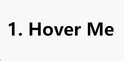
| <h3 class="hover-1">1. Hover Me</h3>
<style>
h3 {
font-family: system-ui, sans-serif;
font-size: 3rem;
margin:0;
cursor: pointer;
padding: 0 .1em;
}
.hover-1 {
line-height: 1.2em;
color: #0000;
text-shadow:
0 0 #000,
0 1.2em #1095c1;
overflow: hidden;
transition: .3s;
}
.hover-1:hover {
text-shadow:
0 -1.2em #000,
0 0 #1095c1;
}
</style>
|
将文字颜色设为透明(#0000),然后生成两个阴影,黑色阴影在原文字位置,用来代替显示文字,蓝色阴影在下方,由于 overflow: hidden 不可见。
当 hover 时,将两个阴影的位置向上调整,加上过渡,就呈现出上图的样子。
悬停效果2
1
2
3
4
5
6
7
8
9
10
11
12
13
14
15
16
17
18
19
20
21
22
23
24
25
26
27
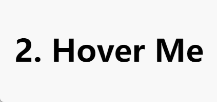
| <h3 class="hover-2">2. Hover Me</h3>
<style>
h3 {
font-family: system-ui, sans-serif;
font-size: 3rem;
margin:0;
cursor: pointer;
padding: 0 .1em;
}
.hover-2 {
line-height: 1.2em;
color: #0000;
text-shadow:
0 0 #000,
0 1.2em #fff;
overflow: hidden;
background:
linear-gradient(#1095c1, #1095c1)
bottom/100% 0 no-repeat;
transition: .3s;
}
.hover-2:hover {
text-shadow: 0 0 #fff;
background-size: 100% 100%
}
</style>
|
与悬停效果一相比多了背景颜色的变化。通过改变背景色的 height 来实现以上效果。
悬停效果3
1
2
3
4
5
6
7
8
9
10
11
12
13
14
15
16
17
18
19
20
21
22
23
24
25
26
27
28
29
30
31
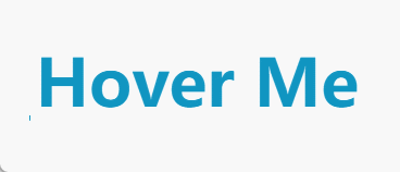
| <h3 class="hover-3">3. Hover Me</h3>
<style>
h3 {
font-family: system-ui, sans-serif;
font-size: 3rem;
margin-bottom: 20px;
cursor: pointer;
padding: 0 .1em;
}
.hover-3 {
line-height: 1.2em;
color: #0000;
overflow: hidden;
text-shadow:
0 0 #1095c1,
0 1.2em #fff;
background:
linear-gradient(#1095c1, #1095c1) no-repeat
200% 100% / 200% 0.08em;
transition: .3s, background-position .3s .3s;
}
.hover-3:hover {
text-shadow: 0 -1.2em #1095c1, 0 0 #ffffff;
background-position: 100% 100%;
background-size: 100% 100%;
transition: .3s .3s, background-position .3s;
}
</style>
|
这个和悬停效果二类似,只不过增加了一个前置动画,两个动画的实现分别通过改变 background-position 和 background-size 实现,先后顺序是通过 transition 的 delay 属性实现的。
悬停效果4
1
2
3
4
5
6
7
8
9
10
11
12
13
14
15
16
17
18
19
20
21
22
23
24
25
26
27
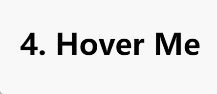
| <h3 class="hover-4">4. Hover Me</h3>
<style>
h3 {
font-family: system-ui, sans-serif;
font-size: 3rem;
margin-bottom: 20px;
cursor: pointer;
padding: 0 .1em;
}
.hover-4 {
line-height: 1.2em;
color: #0000;
text-shadow: 0 0 #000, 0 1.2em #ffffff;
box-shadow: 0 1.2em #1095c1;
clip-path: inset(0 0 0 0);
background: linear-gradient(#1095c1, #1095c1) 0 1.2em/100% 100% no-repeat;
transition: .4s, clip-path .4s .4s;
}
.hover-4:hover {
text-shadow: 0 0 #ffffff;
box-shadow: 0 0 #1095c1;
clip-path: inset(0 0 -1.2em 0);
background-position: 0 0;
transition: .4s .4s, clip-path .4s;
}
</style>
|
这里用到了 clip-path 属性。
clip-path
clip-path 属性使用裁剪方式创建元素的可显示区域。区域内的部分显示,区域外的隐藏。可以指定一些特定形状,比如:polygon 多边形、circle 圆形、ellipse 椭圆、inset 等。
1
2
3
4
5
6
7
8
9
10
11
|
clip-path: polygon(50% 0px, 100% 100%, 0px 100%)
/* 半径以及圆心所在坐标 */
clip-path: circle(50% at 50% 50%)
/* x 轴半径,y 轴半径,圆心 */
clip-path: ellipse(30% 20% at 50% 50%)
/* 上 下 左 右 round 左上角radius 右上角radius 右下角radius 左下角raduis */
clip-path: inset(25% 0% 25% 0% round 0% 25% 0% 25%)
|
这里的 box-shadow 没有设置 blur,它的作用是提供一个与容器大小相同的带有背景颜色的投影。