悬停效果之 background properties
本文将专注于使用 CSS background 属性来实现炫酷的鼠标悬停效果。
background 语法
1 | background:bg-color bg-image bg-position/bg-size bg-repeat bg-origin bg-clip bg-attachment |
各值之间用空格分隔,不分先后顺序。
background-position 与 background-size 之间用”/“分隔。
一个元素可以有多个背景效果,通过”,“分隔。
background-position 与 background-size 的关系
当 background-size 为 100% 时,background-position 百分比无效;
当 background-size 小于容器大小时,背景图片随着 background-position 百分比的增大向右/下移动;
当 background-size 大于容器大小时,背景图片随着 background-position 百分比的增大向左/上移动;
当 background-position 为具体值时,无论 background-size 为多大,背景图都随着 background-position 的增大向右/下移动,反之向左/上移动。
悬浮效果1
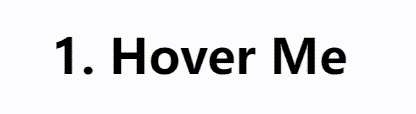
1 | <h3 class="hover-1">1. Hover Me</h3> |
这里不能设置 background-color,因为它不能改变位置和大小,需要使用 background-image。而要想使用 background-image 设置颜色,则需要使用渐变。
在初始状态将 background-position 设置为 0,在元素最左边。当 hover 时,将其改为 100%,在元素最右边,并且取消这一转换的过渡,因此看起来背景色从右到左渲染。
悬浮效果2
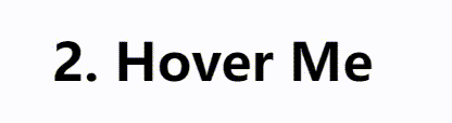
1 | <h3 class="hover-2">2. Hover Me</h3> |
该效果的实现过程是:先将宽 100%,高 0.08em 的背景图隐藏在容器的左外边界,当 hover 时先向右滑动(background-position: 100% 100%),再向上渲染(background-size: 200% 100%)。至于两个过渡的时间差通过 transition 的 delay 属性实现。
因为当 background-size 的 width 为 100% 时, background-position 的 x% 无效,所以这里 background-size 的 width 设为 200%。
悬浮效果3
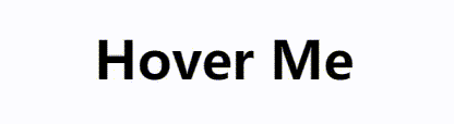
1 | <h3 class="hover-3">3. Hover Me</h3> |
这里需要两个背景图,初始时,分别位于容器的左右外边界。
使背景图位于容器的边界外
背景图默认位于容器的左上角,且始终有 background-position: 0 0 位于左上角,background-position: 100% 100% 位于右下角。
(1)当背景图大于容器大小时:
例如 background-size 为 200% 100%,它此时位于左上角。要想使它位于容器左外边界,那么 background-position 应为 200% 0,右外边界为 -100% 0。
(2)当背景图小于容器大小时:
例如 background-size 为 50% 100%,它此时位于左上角。要想使它位于容器左外边界,那么 background-position 应为 -100% 0,右外边界为 200% 0。
因为背景图从 position 的 0 到 100% 只移动了容器的 50%。那么要想使它位于容器左外边界,需要向左移动容器的 50%,即 position 应为 -100%;要想使它位于容器右外边界,需要向右移动容器的 100%,即 position 应为 200%。
悬浮效果4
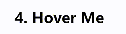
1 | <h3 class="hover-4">4. Hover Me</h3> |
conic-gradient 圆锥渐变
1 | background-image: conic-gradient([from angle] [at position,] color degree, color degree, ...); |
conic-gradient() 函数创建一个由渐变组成的图像。圆锥渐变是颜色过渡围绕中心点旋转。创建圆锥渐变,至少需要设置两个色标。
圆锥渐变应用于 background 的大小位置关系:
首先根据 background-size 在容器的左上角确定一个矩形框,然后在这个矩形框中根据中心点绘制图像,最后根据 background-position 来确定矩形框相对于元素的位置。
该效果的实现过程:通过圆锥渐变创建两个背景,分别让其位于容器的最左边和最右边,初始时 background-size 的 width 为 0,hover 时设为 60%,同时通过 position 改变方向。