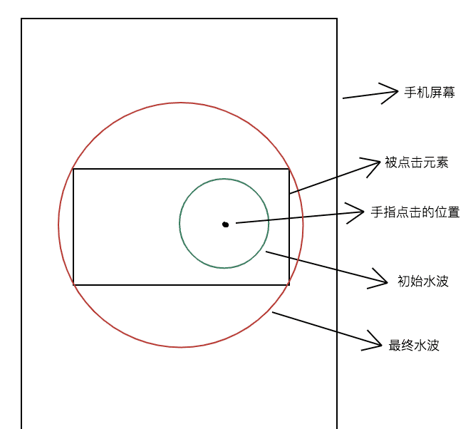
波纹效果
假设 .waves-ripple 类是实现波纹效果的样式,那么它在初始时是一个大小固定的透明的圆,圆心是鼠标点击的地方。在结束时它的直径是目标元素对角线的长度,而且圆心是目标元素的中心。波纹效果就是通过改变它的透明度、伸缩性、位置再加上过渡来实现的。
监听目标元素的 mousedown 事件,当事件被触发时,在目标元素下创建一个 div,并赋予其类(.waves-ripple),然后动态更改其样式(opacity, transform)。
1
2
3
4
5
6
7
8
9
10
11
12
13
14
15
16
17
18
19
20
21
22
23
24
25
26
27
28
29
30
31
32
33
34
35
36
37
38
39
40
41
42
43
44
45
46
47
48
49
50
51
52
53
54
55
56
57
58
59
60
61
62
63
64
65
66
67
68
69
70
71
72
73
74
75
76
77
78
79
| <html>
<body>
<div id="box" class="waves"></div>
</body>
<script>
onload = () => {
const el = document.getElementById("box");
function setConvertStyle(obj) {
let style = "";
for (let i in obj) {
if (obj.hasOwnProperty(i)) style += `${i}:${obj[i]};`;
}
return style;
}
function onCurrentClick(event) {
const diameter= Math.sqrt(el.clientWidth**2 + el.clientHeight**2)
const centerX = el.clientWidth / 2;
const centerY = el.clientHeight / 2;
const scaleNum = diameter / 20;
const divEl = document.createElement("div");
divEl.classList.add("waves-ripple");
el.appendChild(divEl);
const style = {
left: `${event.layerX}px`,
top: `${event.layerY}px`,
opacity: 1,
transform: `scale(${scaleNum}) translate(${(centerX-event.layerX)/scaleNum}px,${(centerY-event.layerY)/scaleNum}px)`,
transtion: "all 0.7s cubic-bezier(0.250, 0.460, 0.450, 0.940)"
}
divEl.setAttribute("style", setConvertStyle(style));
setTimeout(() => {
divEl.setAttribute("style", setConvertStyle({
left: style.left,
top: style.top,
opacity: 0,
transform: style.transform
}))
setTimeout(() => {
el.removeChild(divEl);
}, 700)
}, 450)
}
el.addEventListener("mousedown", onCurrentClick, false);
}
</script>
<style>
.waves {
position: relative;
width: 200px;
height: 200px;
background-color: #1095c1;
overflow: hidden;
cursor: pointer;
}
.waves-ripple {
position: absolute;
width: 20px;
height: 20px;
opacity: 0;
margin: -10px 0 0 -10px;
border-radius: 50%;
background-color: rgba(0, 0, 0, 0.2);
pointer-events: none;
transition: all 0.7s ease-out;
}
</style>
</html>
|
注意: 由于圆是在变大的同时进行移动的,那么它最终的位置与我们预想的位置不一样。假设我们想要它移动 translate(x, y),但它最终移动了 translate(scaleNum*x, scaleNum*y)。因此,要想将它移动到某个位置,需要移动 translate(x/scaleNum, y/scaleNum)。
vue3 波纹指令
src/style/index.css
1
2
3
4
5
6
7
8
9
10
11
12
13
14
15
16
17
18
19
20
21
22
23
24
25
26
27
28
29
30
31
32
33
34
35
36
37
38
39
40
41
42
43
44
| .waves-effect {
position: relative;
cursor: pointer;
display: inline-block;
overflow: hidden;
user-select: none;
-webkit-tap-highlight-color: transparent;
vertical-align: middle;
z-index: 1;
will-change: opacity, transform;
}
.waves-effect .waves-ripple {
position: absolute;
border-radius: 50%;
width: 20px;
height: 20px;
margin-top: -10px;
margin-left: -10px;
opacity: 0;
background: rgba(0, 0, 0, 0.2);
transition: all 0.7s ease-out;
pointer-events: none;
}
.waves-effect.waves-light .waves-ripple {
background-color: rgba(255, 255, 255, 0.45);
}
.waves-effect.waves-red .waves-ripple {
background-color: rgba(244, 67, 54, 0.7);
}
.waves-effect.waves-yellow .waves-ripple {
background-color: rgba(255, 235, 59, 0.7);
}
.waves-effect.waves-orange .waves-ripple {
background-color: rgba(255, 152, 0, 0.7);
}
.waves-effect.waves-purple .waves-ripple {
background-color: rgba(156, 39, 176, 0.7);
}
.waves-effect.waves-green .waves-ripple {
background-color: rgba(76, 175, 80, 0.7);
}
.waves-effect.waves-teal .waves-ripple {
background-color: rgba(0, 150, 136, 0.7);
}
|
src/directive/index.ts
1
2
3
4
5
6
7
8
9
10
11
12
13
14
15
16
17
18
19
20
21
22
23
24
25
26
27
28
29
30
31
32
33
34
35
36
37
38
39
40
41
42
43
44
45
46
47
48
49
50
51
52
53
54
55
| import type { App } from "vue";
export function wavesDirective(app: App) {
app.directive("waves", {
mounted(el, binding) {
el.classList.add("waves-effect");
binding.value && el.classList.add(`waves-${binding.value}`);
function setConvertStyle(obj: { [key: string]: unknown }) {
let style: string = '';
for (let i in obj) {
if (obj.hasOwnProperty(i)) style += `${i}:${obj[i]};`;
}
return style;
}
function onCurrentClick(e: { [key: string]: any }) {
const diameter: number = Math.sqrt(el.clientWidth**2 + el.clientHeight**2)
const centerX: number = el.clientWidth / 2;
const centerY: number = el.clientHeight / 2;
const scaleNum: number = diameter / 20;
let elDiv = document.createElement('div');
elDiv.classList.add('waves-ripple');
el.appendChild(elDiv);
let styles = {
left: `${e.layerX}px`,
top: `${e.layerY}px`,
opacity: 1,
transform: `scale(${scaleNum}) translate(${(centerX-e.layerX)/scaleNum}px,${(centerY-e.layerY)/scaleNum}px)`,
'transition-duration': `700ms`,
'transition-timing-function': `cubic-bezier(0.250, 0.460, 0.450, 0.940)`,
};
elDiv.setAttribute('style', setConvertStyle(styles));
setTimeout(() => {
elDiv.setAttribute(
'style',
setConvertStyle({
opacity: 0,
transform: styles.transform,
left: styles.left,
top: styles.top,
})
);
setTimeout(() => {
elDiv && el.removeChild(elDiv);
}, 700);
}, 450);
}
el.addEventListener('mousedown', onCurrentClick, false);
},
unmounted(el) {
el.addEventListener("mousedown", () => {});
}
});
}
|
main.ts
1
2
3
4
5
6
| import "@/style/index.css"
import { wavesDirective } from "@/directive";
const app = createApp(App)
wavesDirective(app)
app.mount('#app')
|
使用
1
| <div v-waves="light"></div>
|
彩色流动边框
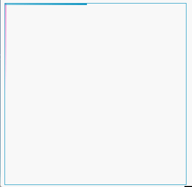
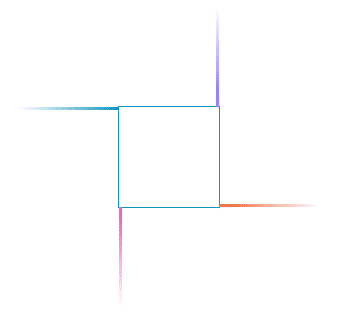
其实现原理是在一个盒子上叠加两个盒子,利用这两个盒子的 :before、:after 给四条边添加渐变色的线。初始时四条线的位置如下图:
然后利用 animation 和 animation-delay 来实现流动的效果。
代码如下:
1
2
3
4
5
6
7
8
9
10
11
12
13
14
15
16
17
18
19
20
21
22
23
24
25
26
27
28
29
30
31
32
33
34
35
36
37
38
39
40
41
42
43
44
45
46
47
48
49
50
51
52
53
54
55
56
57
58
59
60
61
62
63
64
65
66
67
68
69
70
71
72
73
74
75
76
77
78
79
80
81
82
83
84
85
86
87
88
89
90
91
92
93
94
95
| <div class="box">
<div class="wrap1"></div>
<div class="wrap2"></div>
</div>
<style>
.wrap1, .wrap2 {
width: inherit;
height: inherit;
position: absolute;
overflow: hidden;
}
.wrap1:before {
content: "";
position: absolute;
top: 0;
width: 100%;
height: 3px;
z-index: 1;
background: linear-gradient(90deg, transparent, #1095c1);
animation: top 2s linear infinite;
}
.wrap1:after {
content: "";
position: absolute;
width: 3px;
height: 100%;
top: -100%;
background: linear-gradient(180deg, transparent, #1095c1);
filter: hue-rotate(60deg);
right: 0;
animation: right 2s linear infinite;
animation-delay: 0.5s;
}
.wrap2:before {
content: "";
position: absolute;
width: 3px;
height: 100%;
top: 100%;
background: linear-gradient(0deg, transparent, #1095c1);
filter: hue-rotate(120deg);
animation: left 2s linear infinite;
animation-delay: 1.5s;
}
.wrap2:after {
content: "";
position: absolute;
width: 100%;
height: 3px;
background: linear-gradient(270deg, transparent, #1095c1);
filter: hue-rotate(180deg);
bottom: 0;
left: 100%;
animation: bottom 2s linear infinite;
animation-delay: 1s;
}
@keyframes top {
0% {
left: -100%;
}
50%,
100% {
left: 100%;
}
}
@keyframes right {
0% {
top: -100%;
}
50%,
100% {
top: 100%;
}
}
@keyframes bottom {
0% {
left: 100%;
}
50%,
100% {
left: -100%;
}
}
@keyframes left {
0% {
top: 100%;
}
50%,
100% {
top: -100%;
}
}
</style>
|
loading 展示
示例一
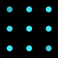
利用网格布局创建九个圆,分别为每个圆添加动画,使其透明度发生变化。对角线元素透明度的变化顺序可通过 delay 实现。animation-direction: alternate 起到关键作用。
1
2
3
4
5
6
7
8
9
10
11
12
13
14
15
16
17
18
19
20
21
22
23
24
25
26
27
28
29
30
31
32
33
34
35
36
37
38
39
40
| <div class="loading-box">
<div v-for="_ in 9" class="loading-item"></div>
</div>
<style>
.loading-box {
width: 200px;
height: 200px;
display: grid;
grid-template-columns: repeat(3, 1fr);
grid-template-rows: repeat(3, 1fr);
background-color: black;
justify-items: center;
align-items: center;
}
.loading-item {
width: 20px;
height: 20px;
background-color: #3cefff;
border-radius: 50%;
animation: fade 1.5s ease-in-out infinite alternate;
}
.loading-item:nth-child(2), .loading-item:nth-child(4) {
animation-delay: 0.25s;
}
.loading-item:nth-child(3), .loading-item:nth-child(5), .loading-item:nth-child(7) {
animation-delay: 0.5s;
}
.loading-item:nth-child(6), .loading-item:nth-child(8) {
animation-delay: 0.75s;
}
.loading-item:last-child {
animation-delay: 1s;
}
@keyframes fade {
100% {
opacity: 0.2;
}
}
</style>
|
示例二
1
2
3
4
5
6
7
8
9
| <div style="width: 150px; height: 150px; display: flex; justify-content: center; align-items: center">
<svg>
<circle cx="75" cy="75" r="50" fill="none" stroke="red" stroke-width="3" stroke-dasharray="1, 400" stroke-dashoffset="0" />
</svg>
</div>
<style>
</style>
|
示例三
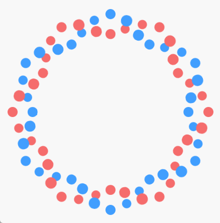
html
1
2
3
4
5
| <div class="loading">
<div class="loading-wrap">
<div v-for="_ in 36" class="dot"></div>
</div>
</div>
|
sass
1
2
3
4
5
6
7
8
9
10
11
12
13
14
15
16
17
18
19
20
21
22
23
24
25
26
27
28
29
30
31
32
33
34
35
36
37
38
39
40
41
42
43
44
45
46
47
48
49
50
51
52
53
54
55
56
57
58
59
60
61
62
63
64
65
66
67
68
69
| .w100 {
width: 100%;
}
.h100 {
height: 100%;
}
.flex {
display: flex;
}
$dotSize: 20px;
$loadingContainerWidth: 350px;
$num: 36;
$rotateDeg: 360deg / $num;
$duration: 2s;
.loading {
position: fixed;
z-index: 9999;
top: 0;
left: 0;
@extend .h100;
@extend .w100;
@extend .flex;
justify-content: center;
align-items: center;
background-color: #f8f8f8;
&-wrap {
position: relative;
width: $loadingContainerWidth;
height: $loadingContainerWidth;
border-radius: 50%;
.dot {
position: absolute;
left: calc(50% - $dotSize / 2);
top: calc(50% - $dotSize / 2);
width: $dotSize;
height: $dotSize;
perspective: 100px;
transform-style: preserve-3d;
@for $i from 1 through $num {
&:nth-child(#{$i}) {
transform: rotate($i * $rotateDeg) translateY(-$loadingContainerWidth / 2);
&::before, &::after {
animation-delay: -$duration / $num * $i * 6;
}
}
}
&::before, &::after {
content: "";
position: absolute;
@extend .w100;
@extend .h100;
border-radius: 50%;
}
&::before {
background-color: var(--el-color-primary);
top: -100%;
animation: moveBefore $duration infinite;
}
&::after {
background-color: var(--el-color-danger);
top: 100%;
animation: moveAfter $duration infinite;
}
}
}
}
|
1
2
3
4
5
6
7
8
9
10
11
12
13
14
15
16
17
18
19
20
21
22
23
24
25
26
27
28
29
30
31
32
33
34
| @keyframes moveBefore {
0% {
animation-timing-function: ease-in;
}
25% {
transform: translate3d(0, 100%, $dotSize);
animation-timing-function: ease-out;
}
50% {
transform: translate3d(0, 200%, 0);
animation-timing-function: ease-in;
}
75% {
transform: translate3d(0, 100%, -$dotSize);
animation-timing-function: ease-out;
}
}
@keyframes moveAfter {
0% {
animation-timing-function: ease-in;
}
25% {
transform: translate3d(0, -100%, -$dotSize);
animation-timing-function: ease-out;
}
50% {
transform: translate3d(0, -200%, 0);
animation-timing-function: ease-in;
}
75% {
transform: translate3d(0, -100%, $dotSize);
animation-timing-function: ease-out;
}
}
|
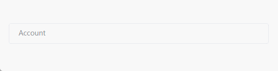
谷歌输入框效果
效果图如下:
代码如下:
1
2
3
4
5
6
7
8
9
10
11
12
13
14
15
16
17
18
19
20
21
22
23
24
25
26
27
28
29
30
31
32
33
34
35
36
37
38
39
40
41
42
43
44
45
46
47
48
49
50
51
52
53
54
55
56
57
58
59
60
61
62
63
64
65
| <html>
<body>
<div class="box">
<label class="label" id="label">Account</label>
<input class="input" id="account" autocomplete="off" onfocus="onFocus()" onblur="onBlur()" />
</div>
</body>
<script>
function onFocus() {
const label = document.querySelector("#label");
label.className = "label-focus";
}
function onBlur() {
const input = document.querySelector("#account");
const label = document.querySelector("#label");
if (input.value) return;
label.className = "label";
}
</script>
<style>
.box {
width: 300px;
position: relative;
}
.input {
width: 100%;
height: 30px;
padding: 5px 15px;
font-size: 14px;
outline: none;
border: 1px solid #dcdfe6;
border-radius: 4px;
transition: all 0.25s ease-out;
}
.input:focus {
border-color: #409EFF !import;
transition: all 0.25s ease-in;
}
.input:hover {
border-color: #c0c4cc;
transition: all 0.25s ease-in;
}
.label, .label-focus {
padding: 0 5px;
font-size: 14px;
position: absolute;
top: 0;
left: 15px;
transform: translateY(calc(20px - 50%));
color: #8D9095;
cursor: text;
transition: all 0.3s ease-out;
}
.label-focus {
color: #409EFF;
background-color: #FFFFFF;
transform: translateY(-50%);
font-size: 12px;
transition: all 0.3s ease-in;
}
</style>
</html>
|
自定义折叠面板
我们在自定义纵向折叠面板时,为了使其有折叠的过渡效果,会设置其初始高度为 0,触发之后的高度为 auto。但是 auto 不是一个固定的高度值,并不会触发 css 的过渡。
那怎么解决呢?一般的解决方案是将 height 替换为 max-height。设置其初始 max-height 为 0,触发之后的 max-height 为一个较大的数值(要大于面板内容的高度),这样就可以实现折叠效果了。但是这里有一个问题:如果面板的内容不确定,那可能需要给 max-height 设置一个非常大的数值,然而 css 高度的过渡是根据 max-height 的值,而不是面板实际的高度,这就会导致收起面板时需要先等一段时间,等到 max-height 值等于面板的实际高度时,面板会快速收起,观感上的过渡时间要小于设置的过渡时间。
现在有一个完美的解决方案,就是将面板设置为 grid 布局,初始时其行高为 0fr,触发时其行高为 1fr。代码如下:
1
2
3
4
5
6
7
8
9
10
11
12
13
14
15
16
17
18
19
20
21
22
23
24
25
26
27
28
29
30
31
32
33
34
| <html>
<body>
<div class="collapse-box">
<button>hover</button>
<div class="collapse-wrap">
<div class="collapse">
<p>xxx</p>
<p>xxx</p>
<p>xxx</p>
<p>xxx</p>
<p>xxx</p>
</div>
</div>
</div>
</body>
<style>
.collapse {
border-radius: 4px;
box-shadow: 0 2px 10px 0 #ECECEC;
width: 200px;
overflow: hidden;
}
.collapse-wrap {
display: grid;
grid-template-rows: 0fr;
transition: all 0.3s ease-out;
}
.collapse-box:hover .collapse-wrap {
grid-template-rows: 1fr;
transition: all 0.3s ease-in;
}
</style>
</html>
|
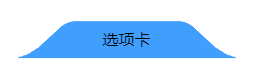
弧形标签页
1
2
3
4
| <div class="tab">
<div class="round-tab"></div>
<div class="title">选项卡</div>
</div>
|
1
2
3
4
5
6
7
8
9
10
11
12
13
14
15
16
17
18
19
20
21
22
23
24
25
26
27
28
29
30
31
32
33
34
35
36
37
| .tab {
width: -moz-fit-content;
width: fit-content;
position: relative;
}
.title {
position: absolute;
left: 50%;
top: 50%;
transform: translate(-50%, -35%);
}
.round-tab {
position: relative;
background-color: #409EFF;
width: 150px;
height: 40px;
border-radius: 10px 10px 0 0;
transform: perspective(40px) rotateX(30deg);
-webkit-user-select: none;
user-select: none;
}
.round-tab::before, .round-tab::after {
content: "";
position: absolute;
width: 10px;
height: 10px;
}
.round-tab::before {
bottom: 0;
left: -10px;
background-image: radial-gradient(circle at 0 0, transparent 10px, #409EFF 10px);
}
.round-tab::after {
bottom: 0;
right: -10px;
background-image: radial-gradient(circle at 10px 0, transparent 10px, #409EFF 10px);
}
|
滚轮实现横向滚动
现在有一组图片,要将其做成轮播的效果,但是要求通过鼠标的滚轮控制其横向滚动。该怎么实现呢?
我们先来看一下完整代码:
1
2
3
4
5
6
7
8
9
10
11
12
13
14
15
16
17
18
19
20
21
22
23
24
25
26
27
28
29
30
31
32
33
34
35
36
37
38
39
40
41
42
43
44
45
46
47
48
49
50
51
52
53
54
55
56
57
| <div class="scroll-container">
<div class="v-scroll">
<div class="content">
<div class="card"><img src="../assets//1.jpg" /></div>
<div class="card"><img src="../assets//2.png" /></div>
<div class="card"><img src="../assets//3.jpg" /></div>
<div class="card"><img src="../assets//4.jpg" /></div>
<div class="card"><img src="../assets//5.jpg" /></div>
</div>
</div>
</div>
<script>
window.onload = () => {
const container = document.querySelector(".scroll-container");
const scroll = document.querySelector(".v-scroll");
scroll.setAttribute("style", `width: ${container.clientHeight}px; height: ${container.clientWidth}px`);
window.addEventListener("resize", () => {
scroll.setAttribute("style", `width: ${container.clientHeight}px; height: ${container.clientWidth}px`);
});
}
</script>
<style>
.scroll-container {
width: 100%;
height: 450px;
}
.v-scroll {
position: relative;
transform-origin: 0 0;
overflow: auto;
transform: rotate(-90deg) translateX(-450px);
}
.v-scroll::-webkit-scrollbar {
width: 0;
}
.content {
position: absolute;
left: 100%;
transform-origin: 0 0;
transform: rotate(90deg);
padding: 0 8px;
display: flex;
}
img {
height: 450px;
display: block;
}
.card {
margin-right: 8px;
}
.card:last-child {
margin-right: 0;
}
</style>
|
实现的原理就通过旋转使竖向滚动变为横向滚动。
- 以
content 元素的左上顶点为圆心,顺时针旋转 90 度到竖直位置,使 v-scroll 发生滚动;
- 以
v-scroll 元素的左上顶点为圆心,逆时针旋转 90 度到水平位置;
- 将
v-scroll 元素向下移动 scroll-container 的高的距离。
注:v-scroll 的宽、高要等于 scroll-container 的高、宽,因为第二次旋转过后两者的(视觉)宽高是一致的。
钉钉官网滚动动画
在钉钉官网可以看到,当我们向下滚动鼠标时,在某一时刻动画开始播放,然后窗口固定不随滚动而移动,且动画完全跟随滚动展开,在之后的某一时刻,动画结束。
想要实现类似效果,需要考虑以下三个问题:
- 如何固定动画区域?
- 动画的组成?
- 什么时候开始动画?什么时候结束动画?
如何固定动画区域
一块区域不随鼠标的滚动而滚动,我们很容易就可以想到粘性布局。
我们将一个页面分为三屏,第一屏和第三屏的大小均为浏览器视窗大小,第二屏用来播放动画,其高为 3 倍的浏览器视窗的高。再在第二屏中创建一个子元素,其大小为浏览器视窗大小,设置为粘性布局。这样在滚动到第二屏时,看到的始终是其子元素。
1
2
3
4
5
6
7
8
9
10
11
12
13
14
15
16
17
18
19
20
21
22
23
24
25
26
27
28
29
30
31
32
33
34
35
36
37
38
39
40
41
42
43
44
45
46
47
48
49
50
51
52
53
54
55
56
57
58
59
60
61
62
63
64
65
66
67
68
69
70
71
72
73
| <body>
<div class="box1"></div>
<div class="box2">
<div class="container">
<div class="list">
<div class="list-item"></div>
<div class="list-item"></div>
<div class="list-item"></div>
<div class="list-item"></div>
<div class="list-item"></div>
<div class="list-item"></div>
<div class="list-item"></div>
<div class="list-item"></div>
<div class="list-item"></div>
<div class="list-item"></div>
<div class="list-item"></div>
<div class="list-item"></div>
<div class="list-item"></div>
<div class="list-item"></div>
</div>
</div>
</div>
<div class="box3"></div>
</body>
<style>
.box1, .box2, .box3 {
width: 100%;
height: 100%;
}
.box1 {
background-color: antiquewhite;
}
.box2 {
background-color: black;
display: flex;
height: 300%;
}
.box3 {
background-color: aquamarine;
}
.container {
width: 100%;
height: 100vh;
position: sticky;
top: 0;
display: flex;
align-items: center;
justify-content: center;
}
.list {
position: relative;
display: grid;
grid-template-columns: repeat(7, 1fr);
grid-template-rows: repeat(2, 1fr);
gap: 200px 50px;
}
.list-item {
width: 100px;
height: 100px;
border-radius: 10px;
}
.list-item:nth-child(2n) {
background-color: green;
}
.list-item:nth-child(2n-1) {
background-color: #363685;
}
.list-item:nth-child(3n-1) {
background-color: #2424c1;
}
</style>
|
什么时候开始动画,什么时候结束动画
什么时候开始动画呢?假如我们想在 .container 完全进入浏览器视窗时开始动画,那么此时鼠标应该滚动的距离为:
1
| box2 顶部到浏览器视窗顶部的距离 + 当前鼠标滚动的距离
|
什么时候结束动画呢?假如我们想在 .container 底部与浏览器视窗底部重合时结束动画,那么此时鼠标应该滚动的距离为:
1
| box2 底部到浏览器视窗顶部的距离 + 当前鼠标滚动的距离 - 浏览器视窗高度
|
动画的组成
可以看到,这些元素变化的主要就是 opacity、scale 和 translate,而且是随着滚动的距离呈线性变化的。当鼠标滚动到某一位置时,这些元素就处于某一特定状态。因此,这些属性的变化可以通过滚动距离计算出来,如下图:
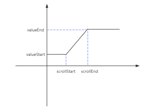
scrollStart 和 scrollEnd 是动画开始和结束时鼠标的滚动距离。valueStart 和 valueEnd 是动画开始和结束时元素 css 属性的值。
因此,可以写一个函数去计算在某一个滚动距离对应的 value:
1
2
3
4
5
6
7
8
9
10
11
| function createAnimation(scrollStart, scrollEnd, valueStart, valueEnd) {
return function(scroll) {
if (scroll <= scrollStart) {
return valueStart;
}
if (scroll >= scrollEnd) {
return valueEnd;
}
return (valueEnd - valueStart) / (scrollEnd - scrollStart) * (scroll - scrollStart) + valueStart;
}
}
|
动画的实现
动画实现主要就是通过监听滚动事件,不断地去更新元素的 opacity、scale 和 translate 的值。
首先获取到 dom 对象:
1
2
3
| const box = document.querySelector(".box2");
const list = document.querySelector(".list");
const items = document.querySelectorAll(".list-item");
|
然后创建一个映射,键是 .list-item 的 dom 对象,值是一个对象,该对象的键是 css 属性名,值是一个返回该属性值的函数。
1
2
3
4
5
6
7
8
9
10
11
12
13
14
15
16
17
18
19
20
21
22
23
24
25
26
27
28
29
30
| const animationMap = new Map();
function updateMap() {
animationMap.clear();
const boxRect = box.getBoundingClientRect();
const scrollStart = boxRect.top + window.scrollY;
const scrollEnd = boxRect.bottom + window.scrollY - window.innerHeight;
for (const item of items) {
animationMap.set(item, getDomAnimation(scrollStart, scrollEnd, item));
}
}
function getDomAnimation(scrollStart, scrollEnd, dom) {
const opacity = createAnimation(scrollStart, scrollEnd, 0, 1);
const scaleAnimation = createAnimation(scrollStart, scrollEnd, 0.5, 1);
const translateXAnimation = createAnimation(scrollStart, scrollEnd, list.clientWidth / 2 - dom.offsetLeft - dom.clientWidth / 2, 0);
const translateYAnimation = createAnimation(scrollStart, scrollEnd, list.clientHeight / 2 - dom.offsetTop - dom.clientHeight / 2, 0);
const transform = function(scroll) {
return `translate(${translateXAnimation(scroll)}px, ${translateYAnimation(scroll)}px) scale(${scaleAnimation(scroll)})`;
};
return {
opacity,
transform
}
}
|
注意:(1)offsetLeft 和 offsetTop 是元素距父元素左边界和上边界的距离,要使其生效必须为父元素设置 position 不为默认值。(2)translate 和 scale 同时使用时让 translate 在前,因为 scale 在前时,translate 的距离会乘上 scale 的值。
这个映射就是用来在滚动距离变化时更新元素 css 属性值的,因此创建一个触发更新的函数:
1
2
3
4
5
6
7
8
| function updateStyles() {
const scroll = window.scrollY;
for (const [dom, value] of animationMap) {
for (const cssProp in value) {
dom.style[cssProp] = value[cssProp](scroll);
}
}
}
|
然后就是调用它:
1
2
3
4
5
| window.onload = () => {
updateMap();
updateStyles();
}
window.addEventListener("scroll", updateStyles);
|
此时会发现所有元素的动画是同时触发的,而钉钉官网上的动画是根据滚动距离依次展开的。要实现这样的效果就要为每个 .list-item 设置各自的 scrollStart。那如何知道当前的 .list-item 是哪一个呢?我们可以借助自定义属性 data-*。
1
2
3
4
5
6
7
8
9
10
11
12
13
14
| <div data-order="0" class="list-item"></div>
<div data-order="1" class="list-item"></div>
<div data-order="2" class="list-item"></div>
<div data-order="3" class="list-item"></div>
<div data-order="2" class="list-item"></div>
<div data-order="1" class="list-item"></div>
<div data-order="0" class="list-item"></div>
<div data-order="0" class="list-item"></div>
<div data-order="1" class="list-item"></div>
<div data-order="2" class="list-item"></div>
<div data-order="3" class="list-item"></div>
<div data-order="2" class="list-item"></div>
<div data-order="1" class="list-item"></div>
<div data-order="0" class="list-item"></div>
|
修改 js 代码:
1
2
3
4
5
| function getDomAnimation(scrollStart, scrollEnd, dom) {
scrollStart += dom.dataset.order * 600;
...
}
|
这里我们使他们相差 600 个滚动距离。
完整代码
1
2
3
4
5
6
7
8
9
10
11
12
13
14
15
16
17
18
19
20
21
22
23
24
25
26
27
28
29
30
31
32
33
34
35
36
37
38
39
40
41
42
43
44
45
46
47
48
49
50
51
52
53
54
55
56
57
58
59
60
61
62
63
64
65
66
67
68
69
70
71
72
73
74
75
76
77
78
79
80
81
82
83
84
85
86
87
88
89
90
91
92
93
94
95
96
97
98
99
100
101
102
103
104
105
106
107
108
109
110
111
112
113
114
115
116
117
118
119
120
121
122
123
124
125
126
127
128
129
130
131
132
133
134
135
136
137
138
| <body>
<div class="box1"></div>
<div class="box2">
<div class="container">
<div class="list">
<div data-order="0" class="list-item"></div>
<div data-order="1" class="list-item"></div>
<div data-order="2" class="list-item"></div>
<div data-order="3" class="list-item"></div>
<div data-order="2" class="list-item"></div>
<div data-order="1" class="list-item"></div>
<div data-order="0" class="list-item"></div>
<div data-order="0" class="list-item"></div>
<div data-order="1" class="list-item"></div>
<div data-order="2" class="list-item"></div>
<div data-order="3" class="list-item"></div>
<div data-order="2" class="list-item"></div>
<div data-order="1" class="list-item"></div>
<div data-order="0" class="list-item"></div>
</div>
</div>
</div>
<div class="box3"></div>
</body>
<script>
const box = document.querySelector(".box2");
const list = document.querySelector(".list");
const items = document.querySelectorAll(".list-item");
function createAnimation(scrollStart, scrollEnd, valueStart, valueEnd) {
    return function(scroll) {
        if (scroll <= scrollStart) {
            return valueStart;
        }
        if (scroll >= scrollEnd) {
            return valueEnd;
        }
        return (valueEnd - valueStart) / (scrollEnd - scrollStart) * (scroll - scrollStart) + valueStart;
    }
}
const animationMap = new Map();
function updateMap() {
animationMap.clear();
const boxRect = box.getBoundingClientRect();
const scrollStart = boxRect.top + window.scrollY;
const scrollEnd = boxRect.bottom + window.scrollY - window.innerHeight;
for (const item of items) {
animationMap.set(item, getDomAnimation(scrollStart, scrollEnd, item));
}
}
function getDomAnimation(scrollStart, scrollEnd, dom) {
scrollStart += dom.dataset.order * 600;
const opacity = createAnimation(scrollStart, scrollEnd, 0, 1);
const scaleAnimation = createAnimation(scrollStart, scrollEnd, 0.5, 1);
const translateXAnimation = createAnimation(scrollStart, scrollEnd, list.clientWidth / 2 - dom.offsetLeft - dom.clientWidth / 2, 0);
const translateYAnimation = createAnimation(scrollStart, scrollEnd, list.clientHeight / 2 - dom.offsetTop - dom.clientHeight / 2, 0);
const transform = function(scroll) {
return `translate(${translateXAnimation(scroll)}px, ${translateYAnimation(scroll)}px) scale(${scaleAnimation(scroll)})`;
};
return {
opacity,
transform
}
}
function updateStyles() {
    const scroll = window.scrollY;
    for (const [dom, value] of animationMap) {
        for (const cssProp in value) {
            dom.style[cssProp] = value[cssProp](scroll);
        }
    }
}
window.onload = () => {
    updateMap();
    updateStyles();
}
window.addEventListener("scroll", updateStyles);
</script>
<style>
.box1, .box2, .box3 {
width: 100%;
height: 100%;
}
.box1 {
background-color: antiquewhite;
}
.box2 {
background-color: black;
display: flex;
height: 300%;
}
.box3 {
background-color: aquamarine;
}
.container {
width: 100%;
height: 100vh;
position: sticky;
top: 0;
display: flex;
align-items: center;
justify-content: center;
}
.list {
position: relative;
display: grid;
grid-template-columns: repeat(7, 1fr);
grid-template-rows: repeat(2, 1fr);
gap: 200px 50px;
}
.list-item {
width: 100px;
height: 100px;
border-radius: 10px;
}
.list-item:nth-child(2n) {
background-color: green;
}
.list-item:nth-child(2n-1) {
background-color: #363685;
}
.list-item:nth-child(3n-1) {
background-color: #2424c1;
}
</style>
|